New ‘Fleece’ of Life for Black Sheep Logo
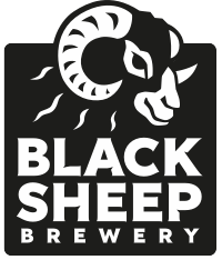
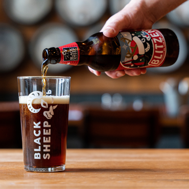
Black Sheep Brewery has given its logo a re-vamp nearly 20 years after its first ale was brewed. It was exclusively unveiled at the UK’s largest agricultural event, the Great Yorkshire Show in North Yorkshire.
Local artist, Will Daykin, who also designed the previous logo, drew up the new version. The colour scheme has been kept the same so the brewery’s products can still be easily identified and the traditional style, synonymous with the business, has remained. The changes to the logo make it clearer and easier to see and more adaptable for branding.
By developing the logo the brewery hopes to build on the business which has already recorded excellent sales figures from the start of the financial year in April.
The Black Sheep Brewery has increased its sales of Black Sheep Ale in bottle by a healthy 13%, and cask beer sales are showing good like for like growth on last year, driven by lead brand Best Bitter and new beer Golden Sheep. Sales have been bolstered by the success of recent limited edition Russian Imperial Stout – a new departure for Black Sheep into the specialist Ale category, and one they hope to repeat in the future.
Jo Theakston, our Director of Marketing, said: “We have put a lot of thought into the design of the logo. We wanted to show that the business is moving forward and aiming to grow. We have kept the image of the sheep as the main focus of the logo, as this is the heart of the brewery and, of course, the name.
“We have adapted the logo so it can be integrated more easily into branding and product labels, helping to implement a more modern and creative design approach to our campaigns.
“Our sales figures are looking healthy for the start of this financial year and we hope that by developing our iconic logo, it will build on the growth of the business as we look towards the future, in particular the development of our new beers such as Russian Imperial Stout.”
